Samp offers complete turnkey solutions to producers worldwide. © Samp
19.03.25
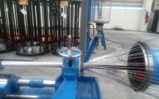
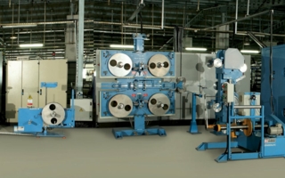
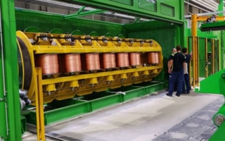
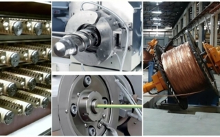
Samp is one of the global leaders in wire and cable machinery manufacturing, offering complete turnkey solutions to producers worldwide. With nearly 90 ...