31/08/2020 – On our own behalf - Wire
Week 35 in retrospect
Here, we present you the top articles from our four categories. This week, the most read one comes from the category „Business“.
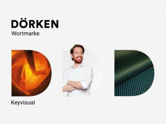
In the new logo the “D” is more highlighted, forming the most important visual element alongside the “Dörken” word mark. This element will not remain static. It changes according to company area and type of use. For example, as illustrated here, it can be filled with a dimpled sheet or with a paint bucket. Or with a person, when it relates to HR subjects. The “D” acts like a magnifying glass, enabling a glimpse inside the company. © Dörken
Reports
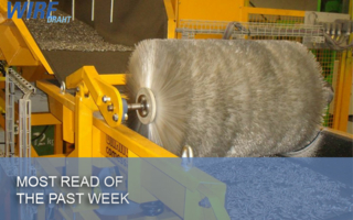
Installation of a Pourtier drum twister line
Business
Research & Development
Energy-efficient processing of high-tech metals
Products
Rosendahl installed a high temp test line at their facility in Austria
Highlight of the week