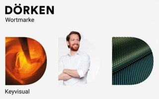
In the new logo the “D” is more highlighted, forming the most important visual element alongside the “Dörken” word mark. This element will not remain static. It changes according to company area and type of use. For example, as illustrated here, it can be filled with a dimpled sheet or with a paint bucket. Or with a person, when it relates to HR subjects. The “D” acts like a magnifying glass, enabling a glimpse inside the company. © Dörken
14.08.20 – Two major operational units
Two major operational units
Dörken has restructured itself. As of 1st of August 2020 there are two major operational units.